

When I started working on the embroidered pieces for my solo show at the Weavers Guild I wrote down a long list of plants I thought would have parts that lend themselves to embroidery. As I worked on the project, I became less focused on the embroidery and increasingly bead-obsessed. I remember the day I was looking through photos, trying to decide on my next subject, when I saw the above Columbine photo I took back in 2017. I saw those long, yellow dangling stamens with their club-like anthers at the end and knew this was it. I could use beads to represent the club-like anthers at the end... a perfect use of beads!
SKETCH
I began as I always do by making a pencil sketch of the flower on tracing paper.

TRANSFER
Below is a short video of me transferring my sketch to the carving plate. ( Music: "Abstract Fashion Pop" by "Qube Sounds" from Pixabay.)

TRANSFER
Below is a short video of me transferring my sketch to the carving plate. ( Music: "Abstract Fashion Pop" by "Qube Sounds" from Pixabay.)
Here is the plate with the transferred image.
CARVING
Strangely, I didn't have very many photos of carving, but you can see the entire carving process in this video. (Music by "RomanSenykMusic" from Pixabay.)
I don't often talk about the next step, but it is important if you are printing with lighter colors. I clean the graphite off the plate with vegetable oil. If I didn't do this step, the graphite would show up in the yellow parts of the flower.

TEST PRINT
In this video I show the cleaning of the plate and how I make a quick test print with a stamp pad. (Music by "Alexi Action" from Pixabay.)
I wish I had made a couple of these prints on nicer paper. I liked how it looked all in red. I could go back and make some, but it is unlikely. (I actually did go back and tried to make some purple prints, but had a phenomenally bad printing day and got zero good prints from my efforts.)

PRINTING

I knew the photo above showed my printing set up better, but I had to include the photo below for the cuteness factor.

I am not normally a rainbow roll type of girl. But this color gradient in the Columbine called out for this technique. For the non-printmakers out there, a rainbow roll involves rolling out two or more different colors of ink and combining them on the roller before inking the plate. It creates a beautiful, soft gradient between the colors.


If you've never seen a rainbow roll in action, watch this video! (Music: "Winning Elevation" by "Hot Music" from Pixabay.)
I always love how the plate looks with wet ink and it was fun to see how the rainbow roll would look on the plate.

IMHO, this is the perfect use of a rainbow roll! I was super pleased with how they turned out.

CHOP SIGNATURE
I don't always show this step either, but I think adding a chop signature adds a lot to the piece. It is always a risk that you might ruin the piece, but I think it is worth it.

EMBROIDERY PLANNING
In order to ensure I wouldn't end up with a half stitch at the end of my embroidery lines, I scanned the print and brought it into Illustrator. In this program I can make all my lines exactly where I want them and then tell it to make the lines "dashed." I can then tell the computer I want each "dash" to be 4 millimeters long. If I had a half stitch at the end of a line, I could then make the "dash" 4.1 or 3.9 mm long.

This may seem like overkill, but it is exceedingly helpful to know where to hammer the holes for the embroidery. When I finished planning I printed out my lines. At first I tried using translucent paper, but I couldn't see the print clearly enough. My friend Tiffany suggested I use a transparency and it worked perfectly. Below you can see the transparency next to the print.

HAMMERING THE HOLES
In order to make the holes in the correct position, I simply placed my transparency onto my print and lined up the edges. Once I started hammering a few holes, the transparency was held in place my the holes themselves. It is nerve wracking at first, but once you get going it is weirdly relaxing.

I took a lot of photos at this stage because I thought the print looked surprisingly pretty with all the holes in it.


SEWING
I toyed with the idea of using a gradient of colors for the embroidery. Here you can see me playing with that idea.

In the end I chose to go with gold embroidery thread. I had already used the gold on the "Buddha Seeds" and thought it would be nice to have a common thread running throughout. Plus, I thought the gold added a mystical element to it. Below you can see the print halfway through the embroidery.


Almost done here!

I am always so relieved to finish. The risk of tearing the paper is no joke and I breathed a huge sigh of relief at the end of this one because the holes were very close together.


BEADWORK
I had A TON of options for the beads on this print. I played around with all sorts of different bead options, including Buddhas, elephants, flowers, various colors of glass beads, seed beads...basically all the beads I owned! I ended up with a mixture of mostly yellow flowers, gold spacers, a cinnabar flower and a single red Buddha. One of the themes I wanted to convey in making these pieces was the idea of finding the miraculous in the mundane. Along those lines I also love the idea that every sentient being has a Buddha-nature. So including the Buddha among the yellow "anthers" worked perfectly.

In addition to bead choice, bead placement was also important. It was helpful to take a photo of various bead placements and then look at them on screen. I started off with the beads too wide and slowly worked my way to their final arrangement (at the top). Here you can see my photo stream from that day.


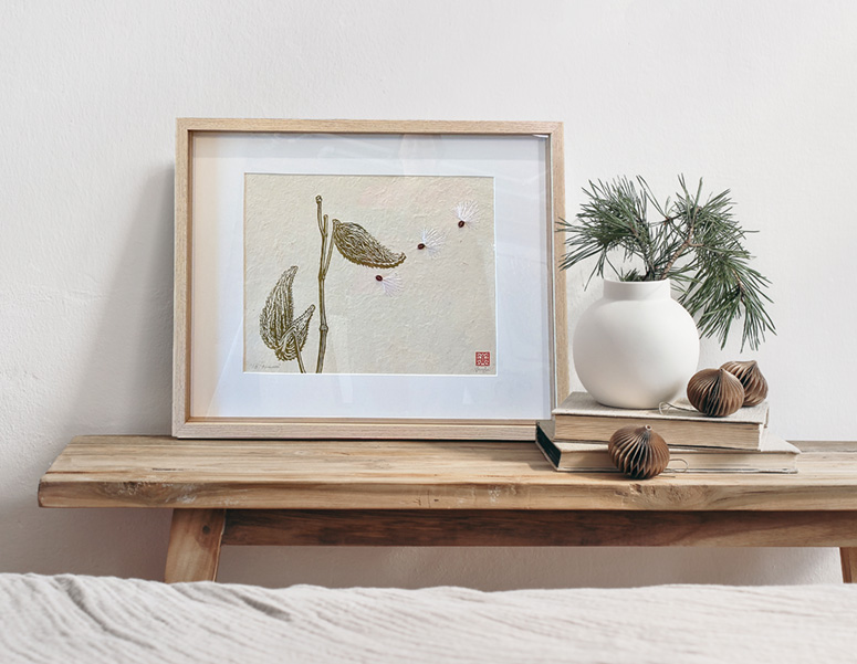
And here is the final embroidered and beaded print!

FRAMING
As I mentioned in my "Milkweed" post, I had to order special frames that had more depth to them to accommodate the beads. I accidentally received MANY frames from my order so I will be offering framed prints on my website.

SHOW
Below you can see the "Milkweed" and "Columbine" together at the Weavers Guild show, plus the label.


While making the above label for the show I was stunned when I found a website that described several aspects of the Columbine I never knew that resonated deeply with me. It described the mantra of the Columbine as "Faith not Fear." I haven't written the post yet about the "Buddha Seeds", but I had a number of synchronicities occur while making that print that had a "theme" of fearlessness. It seems the universe was trying to get a message across to me. I think I struggle quite a bit with fear, as we all do being human. But I have been finding the more I put my faith in life itself, the more life keeps showing up for me in amazing ways. Having faith in life doesn't mean I always get what I want. Rather it means when things don't go my way, I now take a step back...pause...and say to myself, "This isn't the way I wanted to go, but I can't change this...so let's see what there is to see on this new path." And to my surprise, the new path is often fascinating beyond anything I could have come up with.
The website also stated, "The Columbine reminds us that there is far more going on here than what we see and hear in the physical realm." When I read that sentence, I nearly fell over. It is almost verbatim what I have been saying for years since my woo-woo meditation experience!
I don't often talk about the next step, but it is important if you are printing with lighter colors. I clean the graphite off the plate with vegetable oil. If I didn't do this step, the graphite would show up in the yellow parts of the flower.

TEST PRINT
In this video I show the cleaning of the plate and how I make a quick test print with a stamp pad. (Music by "Alexi Action" from Pixabay.)
I wish I had made a couple of these prints on nicer paper. I liked how it looked all in red. I could go back and make some, but it is unlikely. (I actually did go back and tried to make some purple prints, but had a phenomenally bad printing day and got zero good prints from my efforts.)
PRINTING

I knew the photo above showed my printing set up better, but I had to include the photo below for the cuteness factor.

I am not normally a rainbow roll type of girl. But this color gradient in the Columbine called out for this technique. For the non-printmakers out there, a rainbow roll involves rolling out two or more different colors of ink and combining them on the roller before inking the plate. It creates a beautiful, soft gradient between the colors.


If you've never seen a rainbow roll in action, watch this video! (Music: "Winning Elevation" by "Hot Music" from Pixabay.)
I always love how the plate looks with wet ink and it was fun to see how the rainbow roll would look on the plate.

IMHO, this is the perfect use of a rainbow roll! I was super pleased with how they turned out.
CHOP SIGNATURE
I don't always show this step either, but I think adding a chop signature adds a lot to the piece. It is always a risk that you might ruin the piece, but I think it is worth it.

EMBROIDERY PLANNING
In order to ensure I wouldn't end up with a half stitch at the end of my embroidery lines, I scanned the print and brought it into Illustrator. In this program I can make all my lines exactly where I want them and then tell it to make the lines "dashed." I can then tell the computer I want each "dash" to be 4 millimeters long. If I had a half stitch at the end of a line, I could then make the "dash" 4.1 or 3.9 mm long.

This may seem like overkill, but it is exceedingly helpful to know where to hammer the holes for the embroidery. When I finished planning I printed out my lines. At first I tried using translucent paper, but I couldn't see the print clearly enough. My friend Tiffany suggested I use a transparency and it worked perfectly. Below you can see the transparency next to the print.

HAMMERING THE HOLES
In order to make the holes in the correct position, I simply placed my transparency onto my print and lined up the edges. Once I started hammering a few holes, the transparency was held in place my the holes themselves. It is nerve wracking at first, but once you get going it is weirdly relaxing.

I took a lot of photos at this stage because I thought the print looked surprisingly pretty with all the holes in it.


SEWING
I toyed with the idea of using a gradient of colors for the embroidery. Here you can see me playing with that idea.

In the end I chose to go with gold embroidery thread. I had already used the gold on the "Buddha Seeds" and thought it would be nice to have a common thread running throughout. Plus, I thought the gold added a mystical element to it. Below you can see the print halfway through the embroidery.


Almost done here!

I am always so relieved to finish. The risk of tearing the paper is no joke and I breathed a huge sigh of relief at the end of this one because the holes were very close together.


BEADWORK
I had A TON of options for the beads on this print. I played around with all sorts of different bead options, including Buddhas, elephants, flowers, various colors of glass beads, seed beads...basically all the beads I owned! I ended up with a mixture of mostly yellow flowers, gold spacers, a cinnabar flower and a single red Buddha. One of the themes I wanted to convey in making these pieces was the idea of finding the miraculous in the mundane. Along those lines I also love the idea that every sentient being has a Buddha-nature. So including the Buddha among the yellow "anthers" worked perfectly.

In addition to bead choice, bead placement was also important. It was helpful to take a photo of various bead placements and then look at them on screen. I started off with the beads too wide and slowly worked my way to their final arrangement (at the top). Here you can see my photo stream from that day.


And here is the final embroidered and beaded print!

FRAMING
As I mentioned in my "Milkweed" post, I had to order special frames that had more depth to them to accommodate the beads. I accidentally received MANY frames from my order so I will be offering framed prints on my website.

SHOW
Below you can see the "Milkweed" and "Columbine" together at the Weavers Guild show, plus the label.


While making the above label for the show I was stunned when I found a website that described several aspects of the Columbine I never knew that resonated deeply with me. It described the mantra of the Columbine as "Faith not Fear." I haven't written the post yet about the "Buddha Seeds", but I had a number of synchronicities occur while making that print that had a "theme" of fearlessness. It seems the universe was trying to get a message across to me. I think I struggle quite a bit with fear, as we all do being human. But I have been finding the more I put my faith in life itself, the more life keeps showing up for me in amazing ways. Having faith in life doesn't mean I always get what I want. Rather it means when things don't go my way, I now take a step back...pause...and say to myself, "This isn't the way I wanted to go, but I can't change this...so let's see what there is to see on this new path." And to my surprise, the new path is often fascinating beyond anything I could have come up with.
The website also stated, "The Columbine reminds us that there is far more going on here than what we see and hear in the physical realm." When I read that sentence, I nearly fell over. It is almost verbatim what I have been saying for years since my woo-woo meditation experience!
And finally, the Columbine was also described as "a flower for the spiritual seeker." When I started this print, I had no idea the Columbine had these traits. But somehow the photo I snapped in 2017 of a delicate Columbine found its way to me and called out to be made into a print. Life somehow weaves everything together, pulling what appear to be disparate threads in different times and places into one cohesive grand work of art. The magic of it all leaves me in awe. It is indeed the perfect flower for me.


