Last week I attended John Muir Laws'
Wild Wonder Nature Journaling Conference at Asilomar, Pacific Grove, California. Asilomar has a gorgeous campus right on the beach and the week was full of nature journaling classes both in the classroom and in the field. I took mostly field sketching classes where we would sit in a location and sketch for about 30-60 minutes. When I was finished sketching I was some times pleased with what I had drawn, but very often felt my drawings could have gone farther had I had more time. And at the end of the class when everyone laid there sketches out for viewing, I could see elements of other's work I wanted to try.
The subject of "finishing" field sketches is quite controversial. Some argue that the sketch is not meant to look "pretty" but that it simply serves as a way to note field markings and other pertinent information that cannot be gleaned without actually seeing your subject. Others like to have the rule that a true sketch should only be done while sitting in the field and that photos flatten and distort the subject.
But I personally have found that "finishing" field sketches is an invaluable way to improve my skills. I like to challenge myself to see if I can get any of the sketches to a place where I like them. It is my way of spending more time with my subject and allows me to explore new techniques. To me it is fantastically fun to pull out my sketchbook and watercolors, turn on some music and color in my drawings like a child with her coloring book. I truly find this process to be both relaxing and exhilarating at the same time. I do see great value in sketching from life. Nothing can replace it. But I also think there is much to be gained in playing around. So don't be afraid to muck around with a field sketch and try some new things.
“This is the real secret of life -- to be completely engaged with what you are doing in the here and now. And instead of calling it work, realize it is play.”
― Alan Watts
After years of color correcting images in Photoshop I realized there are always a few things that I do the same when I look at any photo or artwork. Below are my top ten tips for "finishing" field sketches. I would love to know of other's strategies for this process so please leave me comments if you have other suggestions.
Some people also argue that a sketchbook should be ugly. There should be scribbly notes, out-of-proportion drawings, and messy attempts. And those who do not have these items are vain, afraid of criticism, or worse..."perfectionists". The perfectionists are people who imagine their sketchbook being opened to people laughing and jeering at the childlike images while chanting "she can't draw!" That scenario makes me laugh just typing it, but don't we all have these fears? I will admit that there is an element of vanity in this "finishing" work, but there is also an incredible amount of juicy fun to be had. So I encourage you to do this only if you think it is fun.
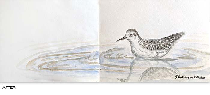
RED-NECKED PHALAROPE
The idea for this post started because my friend
Jodi teased me that I wouldn't show my "ugly" bird on the blog (my words, not hers). It made me pause to think about why we don't like to show our field sketches and what would be helpful to me and others. The phalarope below is a perfect example of what can be learned from working on a sketch at home. While in the field I was able to see this red-necked phalarope through the scope for 10-20 second at a time. I thought I did an OK job at getting some field markings in before some dogs came and scared it away.
But when I got home and pulled out my field guides and images on google, I could see I had the shape of the head wrong. This bird has a tall forehead that looks like it has been smacked with a flat board. I was able to add some height to the head and if I ever have to draw a phalarope again I won't make the same mistake! I was also able to refine the feathers, study the shape of the bill and how it connects to the face, and even try making a shadow in the water! This took about 30-45 minutes and was so much fun!
POINT LOBOS
The class I took with
John Muir Laws was one of my favorites. It is rare to meet someone who is an incredible naturalist, amazing artist, AND a phenomenal teacher. During his class we took a trip to Point Lobos State Natural Reserve where he encouraged us to try either drawing an entire landscape in a small rectangle, or to draw the outline of the landscape and then color rectangular portions of that landscape. I attempted the latter but ran out of time to finish the color before we had to meet back to show our work. When Jack saw mine he said he would leave it just like it was to show the process. I could totally see what he meant, but the thought of it made me squirm inside because I was DYING to see what it would look like finished! Wild dogs couldn't keep me from filling in that last bit of color!


As a side note, my original plan was to put the Point Lobos logo in the circle. But after I finished coloring in the rectangles I changed my mind. I decided I just wanted to put the color of the waves and water in the circle. After I finished it looked kind of plain so I penciled in a little sea lion (lobo marino means sea lion in Spanish). We had seen them off the point that morning and even though I didn't see one while sitting there I couldn't resist because I friggin LOVE sea lions! (It just occurred to me that tip number 11 should be "Don't be afraid to add elements to your sketch that weren't there but that help you get a sense of place...in other words...put a bird on it! or a sea lion!)
ABRONIA
This sketch is a perfect example of trying something, but liking it the way it was to begin with. I knew I kind of liked this fleshy plant just like it was...sketchy and soft. But I also knew it would pop more if I inked the outlines. Once an idea springs in my head it is hard not to do it. The solution to this dilemma is to always take a picture first. That way you can have your cake and eat it too.
OAK FOREST
This was one of my least favorite sketches and I wasn't really interested in fussing or playing with it. So I left it alone.
GIANT SEA KELP
Sadly, the Giant Sea Kelp is another example of a sketch where I liked the "before" better than the "after." But I learned so much from this process. I have been struggling lately between leaving my sketches as just watercolor or inking them in. I find that inking them in is an easy way to distinguish elements but that it turns out more cartoony. It's not that cartoony is bad, but it is just a whole different look. I find that through this process of "going too far" I am learning when to stop. I did at least get to try splatter painting the sand in this one.
This sketch was done in a class by
Catherine Hamilton on "Improving Live Drawing and Color Perception Skills." If you ever get a chance to take a class with her DO IT! She is incredibly knowledgeable and you must follow her on Instagram (
@birdspot).
ASILOMAR DUNE MAPPING
During the conference I signed up to take a class on making maps with
Emily Underwood. We were led up to a bluff overlooking the dunes with a boardwalk. Unfortunately the fog was rolling in and we could barely see so we had to use a bit of imagination. I wasn't that into my sketch, but while I was sitting there I had the thought it would be cool to add a compass rose. I had so much fun drawing it but after I added it I thought it was a bit too heavy for the drawing. I then tried to thicken the dune lines which I quickly regretted. The only extra bit that I did afterward that I liked was to add shadows to the plants. Again, this one might have been better left alone, but next time I do a map I will know to keep the compass rose light.
SPHINX MOTH
This was a fairly quick sketch of a moth I did while in the "How to Draw Insects" class by
Stephanie Dole . Sometimes when I have a photo or a drawing that is fairly unremarkable I like to add text to it to spice things up. Adding type to images often has a magical effect. Since this moth was very muted in its color scheme I decided to leave it un-inked and to do the text in watercolor pencils. In my humble opinion, the text really helped to add interest to this image.
Also, just a note that you can get so many free fonts now. I like to use
dafont.com. I have never liked my handwriting and it has lead to a love of fonts. If I am being particular I will print it out, pencil the back of the paper, and then trace it to transfer the type. If I am being ridiculously particular I will scan the image, drop the text in, and then print and transfer to my sketch. But last year when I was in Guatemala I didn't have access to any printer so I ended up just looking fonts up on my phone and drawing them onto my sketchbook. Going through all of these various processes has made me more confident in drawing type.
OBI KAUFMANN
While taking a class from
Obi Kaufmann I did a quick sketch of him doing a watercolor demo. I liked the simplicity of just adding a small line of text for his name. Also, after checking the reference photo I added a little red to his necklace which made me happy (oh, the little things!).
ASILOMAR STATE BEACH
This last sketch is a perfect example of darkening the darks and increasing hue saturation. After the class everyone laid their sketchbooks down on the sand and I noticed one woman's work was stunning. I also noticed she had beautifully darkened the rocks where the water touched them and where the shadows were darkest. In my mind I noted it and decided that if I returned to this sketch I would do the same. I also noticed that some people had captured the waves perfectly. I had essentially left a white space for the waves because I wasn't sure what to do. At first I tried darkening the back of the wave. Then I tried dry-brushing a curve but didn't like the detailed look with the rest of the sketch. Then I realized that a wave is just a cylinder on its side and tried to smooth it all out and shade it like a tube. I am not sure I hit the nail on the head, but wow was it good practice drawing water!
The final element I added was the second circle in the sky. My friend
Jessica always makes these incredible circles in her skies and I love them. My first circle was a happy accident from my plastic water cup. So this morning I tried to make a circle with a water glass. It wasn't quite as perfect but was as fun experiment.
In some sense there were winners and losers with these "befores" and "afters." In certain sketches I made improvements here and mistakes there. But if you consider all of my mistakes as learning opportunities then I think I won lots of prizes.
In addition to the technicalities of improving my watercolor skills, the most important thing I have learned through this process is discovering what I like. I consider art as a process of learning about myself. What subject draws me in? Do I like the color darker or lighter? Do I want this line thinner or thicker? Should I add highlights? And the beauty is no one can answer those questions but me. In other words, what makes me happy? What makes my heart sing? I believe art is a way of finding what brings you joy and if we could all do that what a wonderful world it would be.
"I see trees of green, red roses too
I see them bloom for me and you
And I think to myself what a wonderful world
I see skies of blue and clouds of white
The bright blessed day, the dark sacred night
And I think to myself what a wonderful world"
Songwriter, George Weiss, Robert Thiele