“You’re constantly surrounded by signs, coincidences, and synchronicities , all aimed at propelling you in the direction of your destiny.”– Denise Linn
INSPIRATION
In February 2021 a strange synchronicity occurred. I received a package in the mail from my friend, Courtney, who I hadn't seen for a while (I hadn't seen any of my friends in a while at that point due to the pandemic.) She sent me a booklet she saw at an antique store called Hexology: the History and The Meaning of the Hex Symbols by Jacob and Jane Zook. She said she saw it and thought of me.
I was delighted to have such a wonderful surprise arrive at my doorstep. Courtney knows that I love folk design and this book was chock-full of really nice examples of Pennsylvania Dutch hex signs. Some view the hex signs as simply decorative while others believe the signs bring good luck, abundance, protection, or good weather for crops. (For more hex sign meanings read here.) Below are some examples from the book.
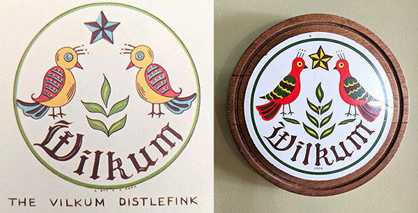
The amazing thing that happened when I turned to the back cover of the book was that I recognized the "Vilkum Distlefink". A couple years ago I purchased the exact same sign at an antique show and glued it to a round piece of wood. It now hangs in my entryway. What are the chances that my friend would send me a book with the exact same sign? Apparently the "distlefink" is a sign of good luck and happiness.
DESIGN
I hadn't thought about the book my friend sent until this summer when, out of the blue, my Dad asked me to paint him a "barn emblem." I had no idea where he got that idea, but I knew where to look for inspiration. I poured through the book and internet and considered several different routes. At first I thought he should have a Native American inspired design because of his heritage. I sent him a few options. Then he said he had looked at several Pennsylvania Dutch designs and his original idea had leaves going around the edges. So I decided to try to marry the two inspirations (Native American and Pennsylvania Dutch) by incorporating a "sun" and "quilt" look. Below you can see how I played around with the design in Illustrator until I honed it down to the final choice (starred in red).
After the design was finalized, I printed it out to the size of the wood circle we bought which was thirty inches. Below you can see my assistant checking it out.
PAINTING
Once I had the print out, I had to transfer it to the wood circle. I bought a really nice, giant compass from Amazon. I was really impressed with how heavy duty it was and it was very helpful in transferring the design. I also used carbon paper to help me transfer the triangles.
I wasn't a hundred percent sure that using painter's tape would give me really clean lines. I bought the green "frog tape" that is supposed to do just that, and it worked wonderfully. I did paint a white layer first so that if it was going to bleed, it would bleed white onto the white background. And then I did the color layer after the first white layer dried.
I was especially impressed that I was also able to cut the tape and it still gave me clean lines! Below you can see I placed the green tape where I wanted my outer circle. I then scribed a circle with the compass and used an X-acto blade to cut the tape. It worked incredibly well!
This 60 second video shows the entire process from sketch to painted finish. Turn your volume on! (Music by lesfm from Pixabay)
OHIO STAR
After I posted the photo below on Instagram, my friend Mark sent me a message asking if I knew the significance of the Ohio star. I found out what I thought of as the blue "quilt" part of the design, is actually called an "Ohio Star." This shape has a rich history in the quilting world and has been around since the early 1800's. The "block" has been called by several names but earned the name "Ohio Star" in honor of the town of Oberlin, Ohio and Mary (quilter) and Lewis Leary, and John Brown's anti-slavery efforts. (The full history can be found here and here.) I had no idea when I chose that shape that it was an important historical symbol for Ohio!
SIGNING & COATING
I knew the sign was going to get a lot of sun hanging on the shed and that it should probably be protected from both the weather and the sun. Before coating it, I signed the back of the hex sign with a red Sharpie pen. I then sprayed it with exterior water-based Varathane. I did a TON of research about this. It came down to the Varathane spray or Minwax Polycrylic water-based polyurethane. I learned it is important to use water-based polyurethan because oil-based poly will give white paint an orangish hue. One could also use an epoxy coating, but I didn't look into that option too much because this seemed way easier. I will report back in a year or so to see how this held up. I think you are probably supposed to do this every year to provide UV and weather protection.
INSTALLATION
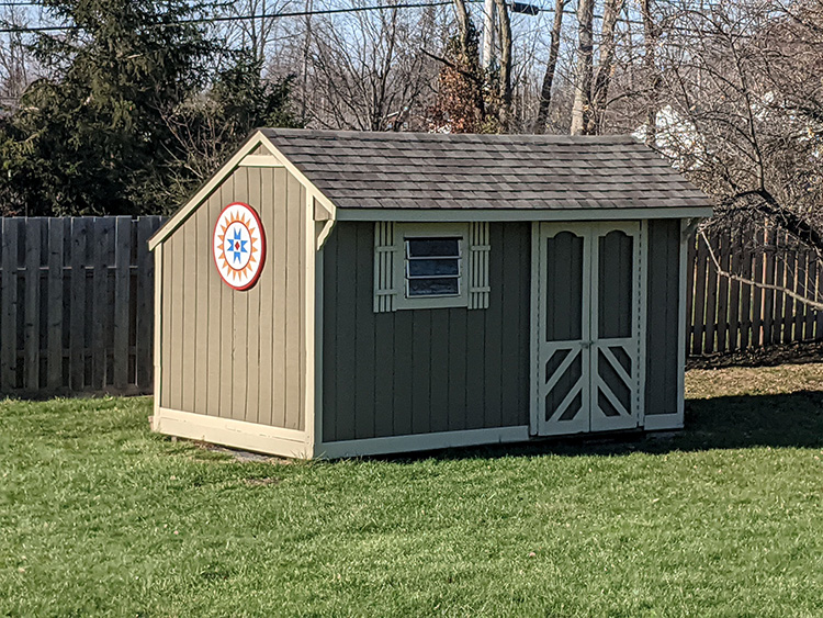
My original idea for hanging the hex sign was to simply put a wire across the back and hang it by a screw on the shed. But my Dad was worried about the wind picking it up (he recently lived through a bad tornado). I then came up with what I thought was a genius idea. I thought we could use two French cleats facing parallel to each other to form a sleeve. And then George had the even more genius idea to turn the two cleats vertical and put a stopper underneath so the sign would hit the stopper and be held in place by gravity and the cleats. I bought the cleats and on Thanksgiving day we went out to install them and realized our beautiful plan was foiled by the uneven, wonky walls of the shed.
In the end we went with the simpler method of attaching 3 stainless steel D-rings to the back.
We then marked the placement of the D-rings on the paper template, drilled three holes in the shed, strung wire through the rings and pulled it through the three holes. On the back side we just twisted the wires around each other to hold it tight.
When my Dad first asked me to make him a "barn emblem" back in September, I didn't know that he was going to have knee replacement surgery at the end of October. The timing of it worked out perfectly so that I worked on painting the sign when I went up to stay with him after his surgery. After a difficult day or two, we got into a routine where I would help him come down his stairs and set him up in front of the TV. We would then eat breakfast together. Usually around the time the "Price is Right" came on, I would start working on taping and painting the sign. As I was painting we would both be rooting for the contestants to spin a dollar on the big wheel or exclaiming when someone won a fancy car or vacation. I loved spending this time with my Dad. I like to think that love worked its way into the paint and rays of this Ohio star, and will shine brightly for many years to come.
“We have calcium in our bones, iron in our veins, carbon in our souls, and nitrogen in our brains. Ninety-three percent stardust, with souls made of flames, we are all just stars that have people names.”— Nikita Gill
“What are we but shooting stars, hoping to shine long enough to make at least one soul believe in the magic.”— Sherry Namdeo
A big "THANK YOU" to my incredibly supportive husband George. You make all my crazy projects possible and tolerate endless discussion about mundane details of French cleats, miniature, stainless steel screw eyes, and weight capacity of D-rings. You are truly my partner in all projects and I love you.
The architecture of Cincinnati never ceases to amaze me. In addition to the Tudor and Bungalow style, one of my absolute favorites is the Swiss Chalet. So when my friend and neighbor, Julie, asked me to do a house portrait for her I was so excited!
The Swiss Chalet style experienced a revival in North America from 1900 to 1925. Architect Andrew Jackson Downing was credited for the resurgence of the style after publication of his book, The Architecture of Country Houses (1850). The style was also popularized by the publications of William S.B. Dana’s,The Swiss Chalet Book (1913), and Henry Saylor’s Architectural Styles for County Houses: The Swiss Chalet Type (1912).
The Swiss Chalet style was not widespread in the United States, but we are lucky that Cincinnati was one of the rare locations where it enjoyed popularity. Cincinnati architect, Lucien Plympton, is credited with bringing the Swiss chalet style to Cincinnati during the Arts & Crafts era of the early twentieth century.
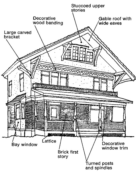
The City of Cincinnati's website offers this diagram to show some of the characteristics of the style:
In my pencil sketch below, you can see my friend Julie's house displays the gabled roof with wide eaves, the decorative wood banding, large carved brackets, and a bay window. The house had so much intricate detail that I ended up having to enlarge some of the fancy woodwork in my sketch...otherwise it was simply too small to draw. When I think about whoever built this house and all the attention to detail, it blows my mind!
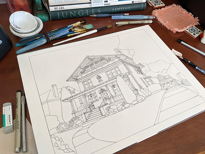
Once the pencil sketch was finished I used carbon paper to transfer the drawing to heavy watercolor paper. I was not very happy with the transfer. It was super light and left a lot of fuzzy carbon everywhere that didn't erase well. I wish I had taken a picture of it at that stage. I ended up basically having to re-draw it entirely in pencil again. I figure by the time I am done with the portrait I have easily gone over each line about 5-7 times. Below you can see the inked-in drawing.
Adding the watercolor is my favorite part of the process. Below you can see the house with just two colors. I often like how it looks at this stage and want to stop. But of course, I could never stop here because it is so fun to add the shadows that make it look three dimensional.
Here is a video of the process of coloring the sketch from start to finish. Turn on your volume! (Music by Lesfm from Pixabay)
My desk is always a complete and utter mess at the end.
I was watching a video recently about sketchers who are documenting climate change through their drawings. The moderator asked each participant what they thought about the idea that "Attention equals love." Each artist agreed and described their experience of love and loss. I have come across this concept before in various ways and every time I hear it, it strikes me deeply as the truth. The moderator credited it to John Muir Laws and when I googled it I came across this quote:
"Attention is the most basic form of love. Through it, we bless and are blessed." — John Tarrant
I whole-heartedly agree and have long felt that where we put our attention is one of our greatest powers. We don't realize it, but our focused attention is like an ultra powerful beam of love that we can direct onto anything we choose. When we consciously give our entire attention to some one or some thing and are fully present, it is a tremendously powerful gift.
To bring it back to the topic at hand, when I look at the Swiss chalet style of architecture, I see these houses as love made manifest. The time and attention that went into crafting all the detail is none other than love in physical form. That is why it feels so good to create. And that is also what happens when we draw something. To drink in all the details and then try to re-create the lines is the deepest form of honoring your subject. The line of the pencil hugs every curve and nuance. If I am truly giving it my full attention, for a moment I become my subject and my subject becomes me and time disappears. To lose oneself in love is one of life's greatest pleasures.
When we moved into our house almost twenty years ago we inherited a GIANT garden full of plants that had been carefully tended by the previous owners, both full-time gardeners. To give you an idea of the attention to detail, we received a map of the garden and almost all of the hostas had little metal labels pushed into the ground next to them with their names handwritten on tiny placards. I have to admit we neglected the yard for a couple years and when I finally turned my attention towards it, it was quite a jungle. Many of the plants, to their credit, managed to survive behind and under the weeds.
One plant, in particular, always caught my attention. Even though I never tended to it, a beautiful sprig of pink blossoms would push its way out of lettuce-like foliage each spring. I always thought the leaves left a little to be desired with their thick, vegetable-type appearance, but the plant slowly made its way into my heart. And each spring I became more and more enamored with the flowers. After maybe fifteen years I finally asked my friend from Finland if she knew what it was and she said it was "Bergenia." When I looked it up, I found it's scientific name is Bergenia cordifolia...cordifolia meaning heart-shaped leaves. The plant is commonly called "Pigsqueak" because the leaves "squeak" when rubbed between thumb and finger. It has also been described as "tough as nails."
“If we could see the miracle of a single flower clearly our whole life would change.” – Buddha
So when Tiger Lily Press asked if I would make a linocut print for their annual calendar, the hardy plant with the funny name and beautiful pink blossoms called out to me.
SKETCH AND TRANSFER
I always begin each print by making a pencil sketch of my subject. I also planned to make a circular "chop" signature which I lightly drew in the bottom right-hand corner of the sketch. Below you can see my sketch and the sketch transferred to the block.
I almost always use Safety-Kut for my carving material, but this time I used "real" linoleum because I was going to be printing at Tiger Lily with one of the presses (Safety-Kut mushes on a press). I normally transfer my sketch onto Safety-Kut by flipping the pencil sketch over and rubbing. However, I wasn't sure it would transfer as well onto real linoleum so I ended up using carbon paper (shown below). This detail will become important later!
CARVING
Once the image is transferred to the plate it is time to carve! Carving is my favorite part of the process and I LOVE how the plate looks during the carving process...so bear with me for showing so many photos.
In this video I show how to make perfect circular holes in linocut using a drill bit.
You have to be careful when you leave the room for any amount of time. Their are lurkers who try and steal your seat.
I thought the plate looked especially pretty at this stage.
This video shows the entire carving process from start to finish. Turn on your volume!
Below you can see the photo, sketch and carving all together. An experienced printmaker might notice a problem when looking at this photo. When I took the photo I was still in ignorant bliss.
TEST PRINT
The following one-minute video shows me inking the plate for the first time and pulling a test print. Again, turn on your volume!
As you can see below, I discovered I'd made a rookie mistake and forgot to flip my image when I transferred it to the plate. Because I used carbon paper, the image was a direct transfer. Hence the print is backwards. Normally with a flower it wouldn't matter too much. But if you remember, I had wanted to put a "chop" signature in the bottom right-hand corner...and that was not going to work anymore.
“…this is the way reality appears in this moment, and we do not want to argue with reality any longer, for to do so only increases our struggle.” ― Matt Licata, A Healing Space
I fretted over what to do for a couple days. Should I put the chop in the lower left-hand corner? Not do the chop? Re-carve?
In the end I decided to re-carve the whole piece. Since I was re-doing it, I made a few improvements. I usually like for the lines of my subject to break the border and I forgot to do that the first time around. So, maybe in the end I was meant to carve it again. Below you can see the new carving on the left and the old on the right.
PRINTING
In late May I went to Tiger Lily Press to print the calendar with studio manager, Susan Naylor. Susan is a genius when it comes to making jigs to print on the Vandercook Proof Press. Below you can see Susan placing a calendar page onto the plate and how the plate fits perfectly snug in its jig.
The above photo was taken about midway through printing before our printing woes began. Our goal was to print at least 120 prints, and at around 108 we started to have a problem with blurry prints. We struggled and fussed with the jig for about an hour before we decided to call it quits. I figured I would hand-burnish the rest at home. Below you can see the problem. After a while the plate can get warped which causes movement in the press and hence blurry prints.
Because I had been having some shoulder issues, I enlisted the help of my best-burnisher husband George. He helped me print the remaining calendar prints plus a handful more that will eventually be available at NessyPress.com.
HAND-TINTING
The calendar is typically printed in one color (usually black) and from the very beginning I knew I might be disappointed to make a black-and-white print of such a colorful flower. I figured once they were printed I would time myself hand-tinting one with watercolor to help me decide if I really could paint all 120 prints. My test print only took me less than 5 minutes so I did the math and figured that 120 prints would take me 10 hours. Little did I know that as I went along I would spend longer and longer on each one. In the end it took me weeks to finish them all. This video shows a sped-up painting of one of the prints. Turn your volume on!
"To be entirely present to each thing that crosses our consciousness, to our most banal and repetitive experiences, is the door to awakening." —Daniel Odier, Tantric Quest: An Encounter with Absolute Love
CHOP SIGNATURE
After finishing the hand-tinting I started thinking about the "chop" signature. I love the way Japanese prints are often signed with a red "chop" in the lower right hand corner. I decided to make a butterfly chop for two reasons: 1) because my name, "Vanessa," is the genus of a butterfly, and 2) because a butterfly is appropriate for a flower print. I also ended up hiding my initials in the body of the butterfly. Below I highlighted the vertical "V", "A", and "S" in black and grey so you can see the hidden letters.
Originally I thought I would use Safety-Kut to carve the chop. After two failed attempts at getting enough detail I thought I would try carving out of wood. A quick trip to Michaels and I came home with some thin wood circles. I was able to get more detail from the wood and ended up gluing the wood disc to a small dowel rod. The results were OK, but still not as crisp as I would have liked.
I got attached to the idea that my initials were hidden in the chop and really wanted it to be legible. So I ended up having a rubber stamp made at Hathaway Stamp in downtown Cincinnati.
The photo below show all of my attempts at carving the chop, plus the rubber stamp.
If I could go back in time I would tell myself to stamp the prints first before I hand-tinted them. I ended up ruining about twenty hand-tinted prints with poor stamps. I rolled ink onto the stamp, blotted it once on paper, and then pressed the stamp onto the calendar prints. Some were blurry, some were half there, and some were perfect. The day I stamped them I wanted to cry because I knew I had ruined enough that I was going to have to print (and hand-tint) more "Pigsqueaks". I don't recall now how many I had to re-print now, but in the end I had exactly 121.
DRYING
When Susan and I printed the black and white "Pigsqueak" we added a cobalt siccative that hastens the drying time. She told me I should also add it to the chop when I stamped the prints. I even have cobalt siccative here at the studio, but the day I stamped the prints I didn't end up using it. I figured I had almost a month until the prints were due and I didn't feel like wearing gloves (you really shouldn't get cobalt on your hands). In hindsight "I SHOULD HAVE USED THE SICCATIVE!!!"
After three weeks I started blotting the chop signatures and they were not coming up clean. I could blot the same chop twenty times in a row and it would just keep showing a faint red outline (shown above). Daily I would go down to the studio and blot 30 at a time. Eventually I did a little research and found that red, oil-based Charbonnel, in particular, takes a very long time to dry, but that heat helps. So I started taking about 20 prints out to the car to "bake" for a day or two. Each day I would bring a group in, test them, and put another batch out. Some prints probably "baked" 3-4 times!
At first I kept the prints in my drying rack but I eventually moved them all out to the table so I could easily take them outside.
After about two months (and LOTS of blotting and "baking") the red chops were finally dry!
"Slowness is a divine thing. We have lost the habit of it. With slow, regular, harmonious movement, the consciousness immediately finds its place. The body begins to enjoy the smallest thing. Attention is heightened. We take in the world’s full freshness."
— Daniel Odier, Tantric Quest: An Encounter with Absolute Love
CALENDAR
Below you can see the final hand-tinted, chopped and signed calendar print.
The Tiger Lily Press calendar includes the work of 13 Cincinnati printmakers (cover artist included). Each print can be trimmed free of the grid when that month is over, matted in a standard 11×14 inch mat (with 8×10 cutout) and framed, making it very easy to hang these wonderful pieces on your wall. You can purchase your calendar online here:
It will also be for sale at "Local Ink", the14th Annual Print Market held Nov. 13 from 11-4 at 4222 Hamilton Ave.
All calendars are hand-tinted pink: the Tiger Lily photo was taken before painting.
CONCLUSION
If you include the writing of this blog, the "Pigqueak" project spanned a period of six months. It is easy for me to get frustrated by how long it took. But I like to look back at a project and ask myself "What did I learn?" The first thing that comes to mind is that the universe was trying to teach me patience. A project like this often takes on a life of its own and between my mistakes, printing issues, my decision to hand-tint, and a crazy long drying time, I certainly learned that setbacks happen and the best way to proceed is by focusing on the next baby step.
I also learned that it can be extremely rewarding and difficult to stick to my vision. At numerous points along this path I could have decided to print it backwards or without the chop signature or just leave it black and white. Every time I chose to stick to my original idea it made the project longer. I often struggle with this idea of perfectionism. Is this need to make it perfect killing me? Do I need to let things go in order to be easier on myself? I don't know. But I do know that I am very happy with the way this print turned out. When I look at it I feel happy and proud and a big sense of accomplishment. It turned out exactly the way I wanted and that is a rare thing in printmaking.
Perhaps I am learning to honor both my vision AND my time, body, and mental health. These needs often appear to be in opposition, but navigating this push and pull is the very play of life. I am learning that being willful, persistent and tenacious also requires me to slow down, relax and remain flexible. In other words, if I am the ocean, my waves can't always push forward and break on the beach. They also have to recede. It is a constant ebb and flow...a constant push and pull. This journey between opposites is our life and I am slowly but surely learning to stop resisting the rhythm but to move with it. And when I do, I dance with heart-shaped leaves that squeak and pink stalks push out of the ground to catch my attention.
“Your hand opens and closes, opens and closes. If it were always a fist or always stretched open, you would be paralyzed. Your deepest presence is in every small contracting and expanding, the two as beautifully balanced and coordinated as birds' wings.”
― Jelaluddin Rumi , The Essential Rumi
ADDENDUM
The Pigsqueak prints are now available on my website HERE!