Showing posts with label Linocut. Show all posts

Wednesday, May 28, 2025

"Rocky" Linocut


"Enjoy the Rocky Road"
Vanessa Sorensen

The above quote was taken (and altered) from a little embroidered tag sewn into the lining of a pair of pants I used to own.  The original quote read, "Enjoy the Rough Road."  The pants were from a brand called "Rough Hewn."  I remember wearing those pants through many a difficult time.  And every time I saw that little tag,  I was reminded that even the hard times have something to offer us.

When I was looking for a quote for this post and couldn't find the perfect one, this altered version popped into my head.  To me it has a triple meaning: 1) The aforementioned...enjoy even the tough experiences. 2) Relish the precious time we have with our pets, specifically Rocky. And 3) It is something one might yell out to a person on their way to an ice cream parlor.  Savor that delicious flavor of chocolate ice cream with diced marshmallows and nuts!  Whether difficulty, puppy, or ice cream, treasure this life in all of its various flavors.

INSPIRATION

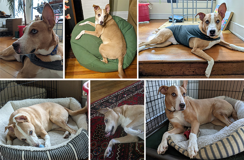
On most Saturday nights we make our way up the street to game night at our neighbors' house.  And every single game night we are greeted by a very enthusiastic boy named "Rocky."  Rocky never seems to tire of greeting us and is very happy when we "accidentally" drop a morsel of food for him to snarf up.  He is a sweet-natured boy who will present his white belly for tummy rubs at a moments notice.  And who could resist belly rubs with that adorable ear sticking up?  Certainly not I.

Last month it was our host Mark's birthday and at the last minute I decided to make him a "quick" linocut.  I poured through my old texts from Mark and found the images below.  


I ended up choosing this photo as my reference, as he is looking very handsome, and it showed his one-ear-pointiness perfectly.
SKETCH

I cropped the photo for my sketch.  I also made a few minor changes to his position and removed his t-shirt.


CARVING

I transferred the drawing to my Safety-kut plate and carved the image using my Flexcut carving tools.  


TEST PRINT

I like to pull a quick test print using a stamp pad to make sure the design is what I want.  After seeing this test I knew I had to shave a bit more off his nose and thin some of the lines a tad.
PRINTING

After making my final adjustments it was time to print.  


Below is a short video of the entire process.  It is rare that I find a song so fitting and I was very pleased with how the video came together.  I googled "songs about dogs" and found Patti Page's "How Much Is That Doggie In The Window?".  When I added the song to my photos and videos, I was surprised at how perfectly it worked.  Make sure you turn your volume on!


I really only needed one good print, but I have learned it the past to make more than I need.  You never know if one might get ruined while adding watercolor.  This time I made an edition of four.


WATERCOLOR

I was going to make a video of adding the watercolor, but I had a weird issue with the paper.  I almost always use Stonehenge paper for my prints as it is the perfect smoothness for hand-burnishing (some of the traditional printmaking papers have a rougher surface and you have to press quite hard to get a nice print).  Stonehenge also takes watercolor beautifully.  When looking for paper for this print, I found what looked like Stonehenge laying around the studio and tore it down to size.  It printed just fine.  That is why I was surprised when I painted the watercolor on and it absorbed immediately into the paper!  Normally you can spread the paint around easily.  I have hand-tinted MANY prints in the past without a problem.  This time the watercolor was not only absorbing fast, but the paper was bubbling up in a bad way.  After I painted the print I thought it was ruined.  It was so puckered.  I was not enjoying the rough road!

I ended up spraying the back side with water and pressing it overnight.  Luckily, in the morning, it had flattened and everything was OK.  Phew!
    
FRAME

The final step was to frame the print.  The size was a little too big for the mat that came with the frame, so I cut a mat to fit the image with the signature.  I can't tell you how many times I have made an image to fit into a store-bought frame and forgot to compensate for the added height of the title and signature.  This time, I bought the frame after the print so I knew I was going to have to cut the mat.  In the end I think he framed up rather well.

Of course, all of this didn't happen the day of Mark's birthday because I woefully underestimated the amount of time it would all take.  But I presented Mark with a test print on his birthday and about a month later gave him the framed print. 

I have mentioned my neighbor Mark numerous times on this blog.  He is my neighbor who has every wood-working tool you can imagine and who has helped on MANY of my projects.  He never hesitates when I text or call him with a crazy idea...and often spurs me on to make them even more difficult!  I am deeply grateful for all his help and time.  A big thank you and HAPPY BELATED BIRTHDAY!!!    

One who finds a faithful friend, finds a treasure.
—Jewish Proverb


Friday, June 16, 2023

Columbine - Embroidered Linocut


INSPIRATION

When I started working on the embroidered pieces for my solo show at the Weavers Guild I wrote down a long list of plants I thought would have parts that lend themselves to embroidery.  As I worked on the project, I became less focused on the embroidery and increasingly bead-obsessed.  I remember the day I was looking through photos, trying to decide on my next subject, when I saw the above Columbine photo I took back in 2017.  I saw those long, yellow dangling stamens with their club-like anthers at the end and knew this was it.  I could use beads to represent the club-like anthers at the end... a perfect use of beads! 

SKETCH

I began as I always do by making a pencil sketch of the flower on tracing paper.


TRANSFER

Below is a short video of me transferring my sketch to the carving plate. ( Music: "Abstract Fashion Pop" by "Qube Sounds" from Pixabay.)


Here is the plate with the transferred image.


CARVING

Strangely, I didn't have very many photos of carving, but you can see the entire carving process in this video. (Music by "RomanSenykMusic" from Pixabay.)


I don't often talk about the next step, but it is important if you are printing with lighter colors. I clean the graphite off the plate with vegetable oil.  If I didn't do this step, the graphite would show up in the yellow parts of the flower.


TEST PRINT

In this video I show the cleaning of the plate and how I make a quick test print with a stamp pad. (Music by "Alexi Action" from Pixabay.)


I wish I had made a couple of these prints on nicer paper.  I liked how it looked all in red.  I could go back and make some, but it is unlikely. (I actually did go back and tried to make some purple prints, but had a phenomenally bad printing day and got zero good prints from my efforts.)


PRINTING


I knew the photo above showed my printing set up better, but I had to include the photo below for the cuteness factor.  


I am not normally a rainbow roll type of girl.  But this color gradient in the Columbine called out for this technique.  For the non-printmakers out there, a rainbow roll involves rolling out two or more different colors of ink and combining them on the roller before inking the plate.  It creates a beautiful, soft gradient between the colors.  


If you've never seen a rainbow roll in action, watch this video! (Music: "Winning Elevation" by "Hot Music" from Pixabay.)


I always love how the plate looks with wet ink and it was fun to see how the rainbow roll would look on the plate.


IMHO, this is the perfect use of a rainbow roll!  I was super pleased with how they turned out.


CHOP SIGNATURE

I don't always show this step either, but I think adding a chop signature adds a lot to the piece.  It is always a risk that you might ruin the piece, but I think it is worth it.


EMBROIDERY PLANNING

In order to ensure I wouldn't end up with a half stitch at the end of my embroidery lines, I scanned the print and brought it into Illustrator.  In this program I can make all my lines exactly where I want them and then tell it to make the lines "dashed."  I can then tell the computer I want each "dash" to be 4 millimeters long.  If I had a half stitch at the end of a line, I could then make the "dash" 4.1 or 3.9 mm long.  


This may seem like overkill, but it is exceedingly helpful to know where to hammer the holes for the embroidery.  When I finished planning I printed out my lines.  At first I tried using translucent paper, but I couldn't see the print clearly enough.  My friend Tiffany suggested I use a transparency and it worked perfectly.  Below you can see the transparency next to the print.


HAMMERING THE HOLES

In order to make the holes in the correct position, I simply placed my transparency onto my print and lined up the edges.  Once I started hammering a few holes, the transparency was held in place my the holes themselves.  It is nerve wracking at first, but once you get going it is weirdly relaxing.


I took a lot of photos at this stage because I thought the print looked surprisingly pretty with all the holes in it.


SEWING

I toyed with the idea of using a gradient of colors for the embroidery.  Here you can see me playing with that idea.


In the end I chose to go with gold embroidery thread.  I had already used the gold on the "Buddha Seeds" and thought it would be nice to have a common thread running throughout.  Plus, I thought the gold added a mystical element to it.  Below you can see the print halfway through the embroidery.


Almost done here!


I am always so relieved to finish.  The risk of tearing the paper is no joke and I breathed a huge sigh of relief at the end of this one because the holes were very close together.


BEADWORK

I had A TON of options for the beads on this print.  I played around with all sorts of different bead options, including Buddhas, elephants, flowers, various colors of glass beads, seed beads...basically all the beads I owned! I ended up with a mixture of mostly yellow flowers, gold spacers, a cinnabar flower and a single red Buddha.  One of the themes I wanted to convey in making these pieces was the idea of finding the miraculous in the mundane.  Along those lines I also love the idea that every sentient being has a Buddha-nature.  So including the Buddha among the yellow "anthers" worked perfectly.


In addition to bead choice, bead placement was also important.  It was helpful to take a photo of various bead placements and then look at them on screen.  I started off with the beads too wide and slowly worked my way to their final arrangement (at the top).  Here you can see my photo stream from that day.


And here is the final embroidered and beaded print!

FRAMING

As I  mentioned in my "Milkweed" post, I had to order special frames that had more depth to them to accommodate the beads.  I accidentally received MANY frames from my order so I will be offering framed prints on my website.


SHOW

Below you can see the "Milkweed" and "Columbine" together at the Weavers Guild show, plus the label.


While making the above label for the show I was stunned when I found a website that described several aspects of the Columbine I never knew that resonated deeply with me.  It described the mantra of the Columbine as "Faith not Fear."  I haven't written the post yet about the "Buddha Seeds", but I had a number of synchronicities occur while making that print that had a "theme" of fearlessness.  It seems the universe was trying to get a message across to me.  I think I struggle quite a bit with fear, as we all do being human.  But I have been finding the more I put my faith in life itself, the more life keeps showing up for me in amazing ways.  Having faith in life doesn't mean I always get what I want.  Rather it means when things don't go my way, I now take a step back...pause...and say to myself, "This isn't the way I wanted to go, but I can't change this...so let's see what there is to see on this new path."  And to my surprise, the new path is often fascinating beyond anything I could have come up with.

The website also stated, "The Columbine reminds us that there is far more going on here than what we see and hear in the physical realm." When I read that sentence, I nearly fell over.  It is almost verbatim what I have been saying for years since my woo-woo meditation experience!

And finally, the Columbine was also described as "a flower for the spiritual seeker."  When I started this print, I had no idea the Columbine had these traits. But somehow the photo I snapped in 2017 of a delicate Columbine found its way to me and called out to be made into a print.  Life somehow weaves everything together, pulling what appear to be disparate threads in different times and places into one cohesive grand work of art.  The magic of it all leaves me in awe.  It is indeed the perfect flower for me.   


This print is now available at NessyPress.com!


Monday, September 12, 2022

"La Alegría" - Variations on a theme


For the past four years I have participated in a show called, "Think Square."  The show features local artists and the premise is that all artwork must be five inches by five inches.  The first year I carved a "Cat and Mouse" linocut, the next year a "Blue Corn" linocut, and the third year was the "Medicine Buddha" linocut printed on a stone woven into a hanging basket.

This year I knew I wanted to explore an idea I've had for a while which was simply painting a folk design onto wood.  Because I have never done this before, I wanted to work the design out completely beforehand.  I picked three flowers from one of my favorite books, "Decorative Flower and Leaf Designs" by Richard Hofmann.  These black and white images are free for use and the "designs were originally intended for a wide range of uses, from hand and machine stitching to stenciling, on materials such as leather, silk, and lace."  

I probably went through about ten to fifteen iterations playing with my design.  Below you can see I started with a leaf-edge border...but when I printed the design out, I felt the flowers were too small.  In order to make the flowers larger I dropped the leaf border.  In the end, I added a green line border.


Working digitally also allowed me to play with color options.  I may eventually try printing a green version.


My original idea was to ask my friend Mark if he could cut me a scallop-edged five inch square.  He has an amazing array of woodworking tools in his basement and has helped me in the past with my crazy projects.  I sent him the file and he said he thought he could do it with his shaper tool, but asked me what was the latest date I needed it.  I told him I would need it a week before it was due.  Little did I know a family emergency would take me out of town for most of the next month.  About 10 days before the project was due I decided I just needed to make something and have it done while I had a few days at home.  So I decided to change plans and transfer my design to a linocut.

LINOCUT

Below you can see the design carved into "Safety-Kut."  


I used a drill bit to make most of the small circles.  


After carving the design, the final step was to cut out the scallop edge.  My trusty helper Bubo was always there to help.


Below is a video of me pulling a quick test print using a stamp pad.  I don't always do this, but it is helpful to get a quick peak to see what needs further carving.


The actual printing went amazingly well.  Working with a small plate like this is so much easier than my usual large plates.  Below you can see my setup.


The video below shows me inking the plate, hand-burnishing, and pulling a print.


I knew I only needed one good print for the show, so I only printed 8.  I may go back and make more at some point...maybe in another color.
Once the prints were dry I pulled out my watercolors to paint the flowers.


This print is now available on my website, NessyPress.com.


WOOD

The day after I finished my linocut my friend Mark told me he finished cutting my scallop-edged wood.  When I saw it, I couldn't believe how perfect it was!  It seemed like a work of art all by itself.


In a way, I hated to paint it.  In the very beginning I had toyed with the idea of carving the design and I did stop to re-consider that option, but I knew that would take me a long time so I proceeded to paint.


As you can see from above, I didn't like my first color.  The blue above was straight out of the tube.  For my second coat I added a little black to produce a more muted navy color. 

To transfer my design to the dark surface I used white Saral paper.


Here you can see the painting about halfway through.


And here you can see the piece mostly finished.  I used acrylic paint that I have had for twenty years.  It worked amazingly well, but the yellow/orange color was a little thick and left a lot of lines.  If I had to do it again I would buy new acrylic paint that comes in the short squeeze bottles that would be a thinner consistency.


“It relaxes my mind to paint flowers." — Pierre-Auguste Renoir

I thought about calling this piece "La Diversión" which technically means "fun" or "hobby, pastime,"  but also references the idea of a diversion.  I painted this piece while under a great deal of stress and the activity of painting was a life-saver.  The act of focusing my concentration on making precise brush strokes forced me to be in the present moment.  And when you are in the present, the mind cannot be thinking about the past or worrying about the future. 

It also occurred to me later, that the idea of being present could help me in the longer term.  I realized after the immediate crisis was over and I returned home, that I was carrying the weight of the situation around with me all the time...it felt like carrying very heavy mental luggage 24/7.  Once I saw this, I tried to ask myself the question, "What is happening right now in this moment?"  This helped me see how my mental luggage was preventing me from feeling the sun and breeze on my skin while sitting on the back porch, or feeling the soft fur of my cat.  It reminds me of a story Rick Archer sometimes tells on his podcast about a person who gets on a train carrying heavy luggage on each arm.  Once they are on the train, they keep holding it tight until someone says, "You know you can put that luggage down and let the train carry that weight?"  Somehow, holding tight to that luggage makes one feel in control, but in reality only wearies the holder.  Plus, it is harder to enjoy the view while holding all that luggage.  I am slowly learning to let life help me carry that weight... I am learning to put down those heavy, controlling, worrisome thoughts that pull me away from the present moment.  I am certainly no expert, but I can see how liberating it can be and how joy is often waiting for me on other side.

“Your life situation may be full of problems — most life situations are — but find out if you have any problem at this moment. Not tomorrow or in ten minutes, but now. Do you have a problem now?”
― Eckhart Tolle, The Power of Now: A Guide to Spiritual Enlightenment


Below is a photo of the final piece.


If you would like to come to the show, the opening reception is Friday, September 16th from 4-8 pm at the Think Shop in Newport, KY.  The show is also up from September 16th through November 18th.  The show has been known to sell every piece so it is a good idea to go early!


I loved how the shadows of the scallops and the frame emphasized the depth of the piece.  Overall, I think this foray into folk painting on wood was a success and I hope to do more in the future.  


A big thank you to my friend Mark for cutting my wood and always supporting me in my artistic endeavors.  Also a big thank you to George for listening to me debate everything and for feeding me delicious food throughout.  It takes a village!